
This picture is worth a thousand words! To understand how a portfolio is really performing you need to compare apples to apples. In this case the apples are volatility since the return a portfolio achieves is a funtion of how much risk is taken. By showing the returns of various portfolios (Vertical Axis) against their level of risk (Horizontal Axis) you can get a more accurate picture how real portfolios are actually functioning. In the chart below, all Five CommonWealth Model Portfolios achieved more return (higher up) but perhaps more importantly they did so with less volatility (further to the left) than the Neutral Balanced Benchmark, which is the pentagon shape down and to the right.
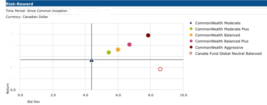
While past performance is no guarantee of future results, a portfolio that achieves less volatility for each unit of return is highly preferable. The yellow dot (above) and the pentagon shape (above) are both 50/50% Balanced Portfolios but they have very different results over the measured time period, i.e. the CommonWealth Model Portfolios produced better returns with less risk.
Call us to discuss how our Five CommonWealth Model Portfolios could suit your risk tolerance.
